Choosing a limited watercolor palette
What is a limited palette?
The last few years of honing in on my style of art for illustrations of children’s books and other personal artwork, I have found that I prefer using a limited palette.
What is a limited palette? Basically using fewer colors of paint in your work.
I personally have found that when doing this it creates more harmony in your work and not having as many choices allows me to work quicker. I have always been one who struggles with choices that can paralyze me, therefore fewer choices is what works best for me.
How do you choose colors for your limited palette?
Decide the type of art you make. Is it landscapes, bold abstracts, or portraits. Once you do that you should be able to choose your colors more easily.
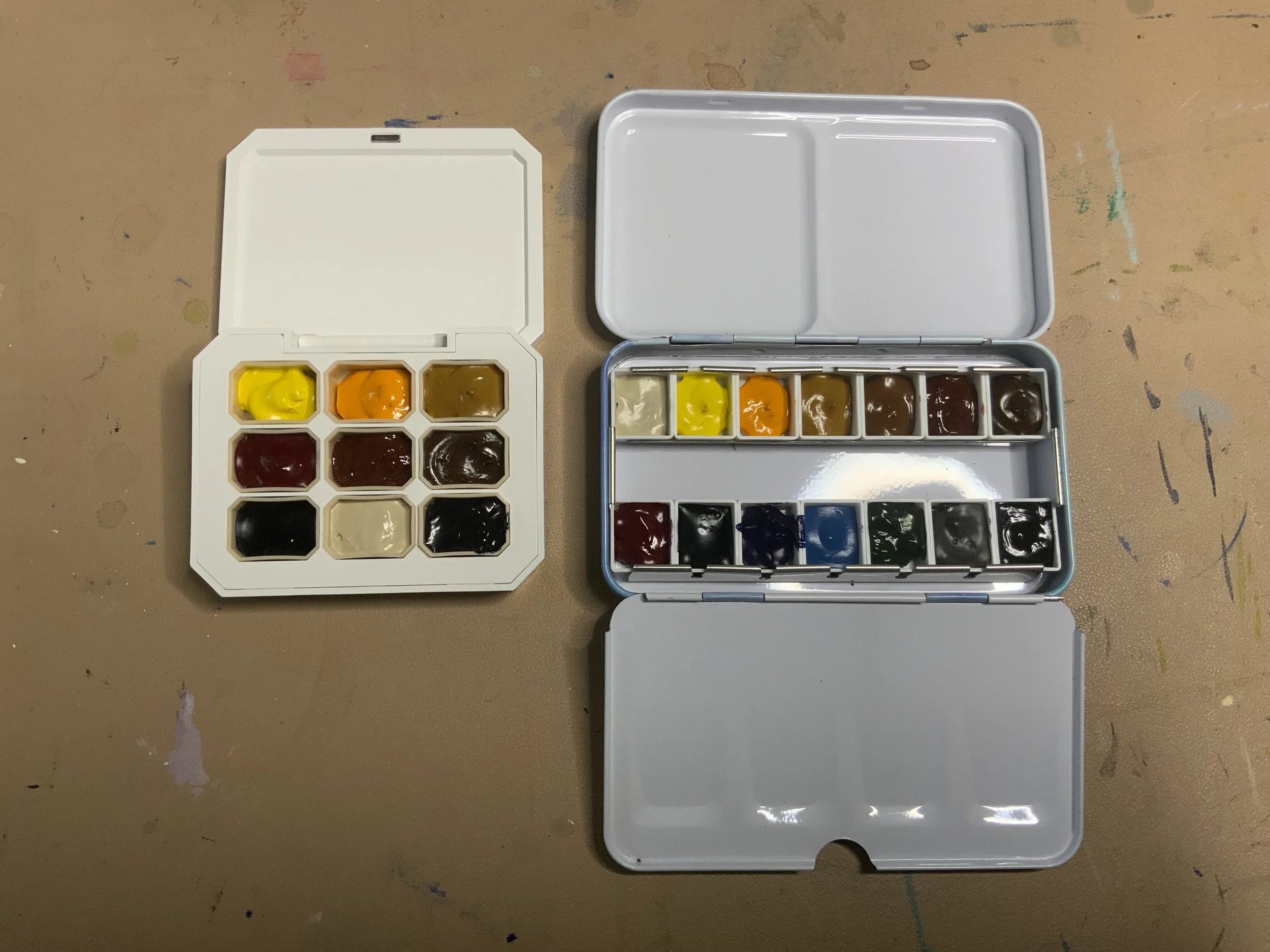
Decide how many colors you would like to limit it to. I have two palettes I use. One for when I am doing quick sketching in the morning and evening out in my cozy living room. Then my studio one I will use for more finished paintings. The one I use in the studio has 14 colors. The one I keep in the living room has 9 colors.
Start with your primary colors. I prefer to have a warm and cool of yellow and a dirty yellow like natural Sienna. I normally can get away without the cool yellow which is lemon yellow but I’m seeing if I use it the next few months. Then this time around selecting my reds I’m just using a Quinacradone Rose. I know that sounds crazy but I plan on using other colors in my palette to make other earthy reds I will need. Then I choose a warm and cool Blue.
Finally, add other colors that help kind of dirty up colors to make them more natural. Since I love the more vintagey style of painting illustrations these colors are important for achieving that look. My personal favorites are burnt sienna, burnt umber, and paynes gray. I do not use black or white on my palette. They just are not necessary in my opinion.
Setting up your pallette
Now that you chose your colors, you can set up your palette.
I start off by cleaning off my palette from any old paint so I can start fresh and clean.
Pull out the colors you want and lay them out in the order you would like them displayed. I personally like my lighter colors like yellow to be first, then my reds, then my blues, then my other miscellaneous colors I choose.
Then I create a small color chart by painting small patches on an index card or watercolor paper. When they are dry I write the colors on top. I find this step so important because its impossible to tell some of the darker colors apart when they are in a palette. I will keep this chart either in the palette or sitting nearby on my art table.
Once I get my palette all set up I will take the time to just play with the colors. I do this by just randomly painting patches and seeing what other colors I can get by mixing various colors together. Having a good play is a great way to learn and just have fun. Below is a look at my current palette and the paints and colors I chose. I hope you can choose your own color palette that will work for your artwork.
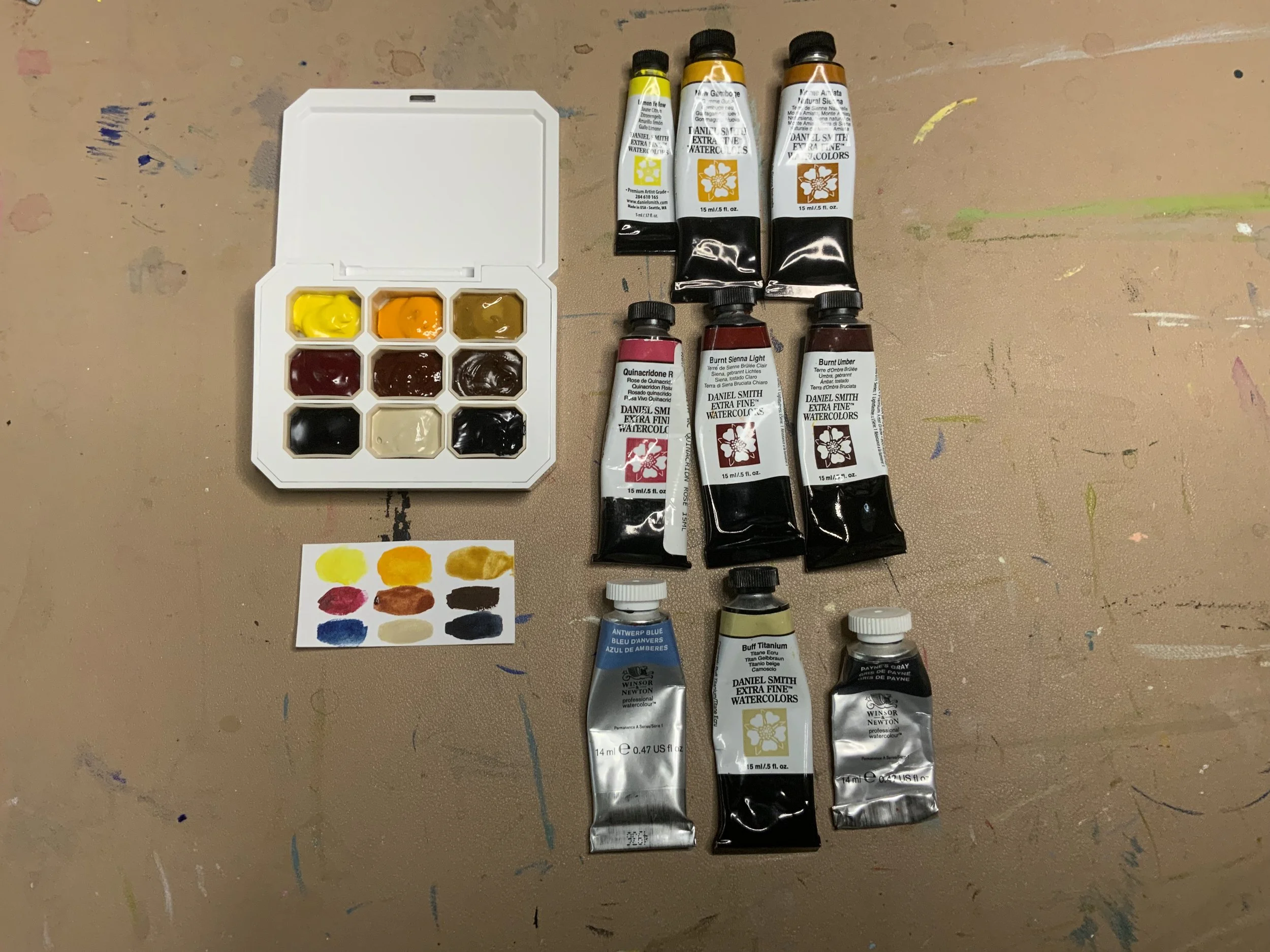
Living room palette. Colors include Lemon Yellow, New Gamboge, Natural Sienna, Quinacradone Rose, Burnt Sienna, Burnt Umber, Antwerp Blue, Titanium Buff, and Payne’s Gray.
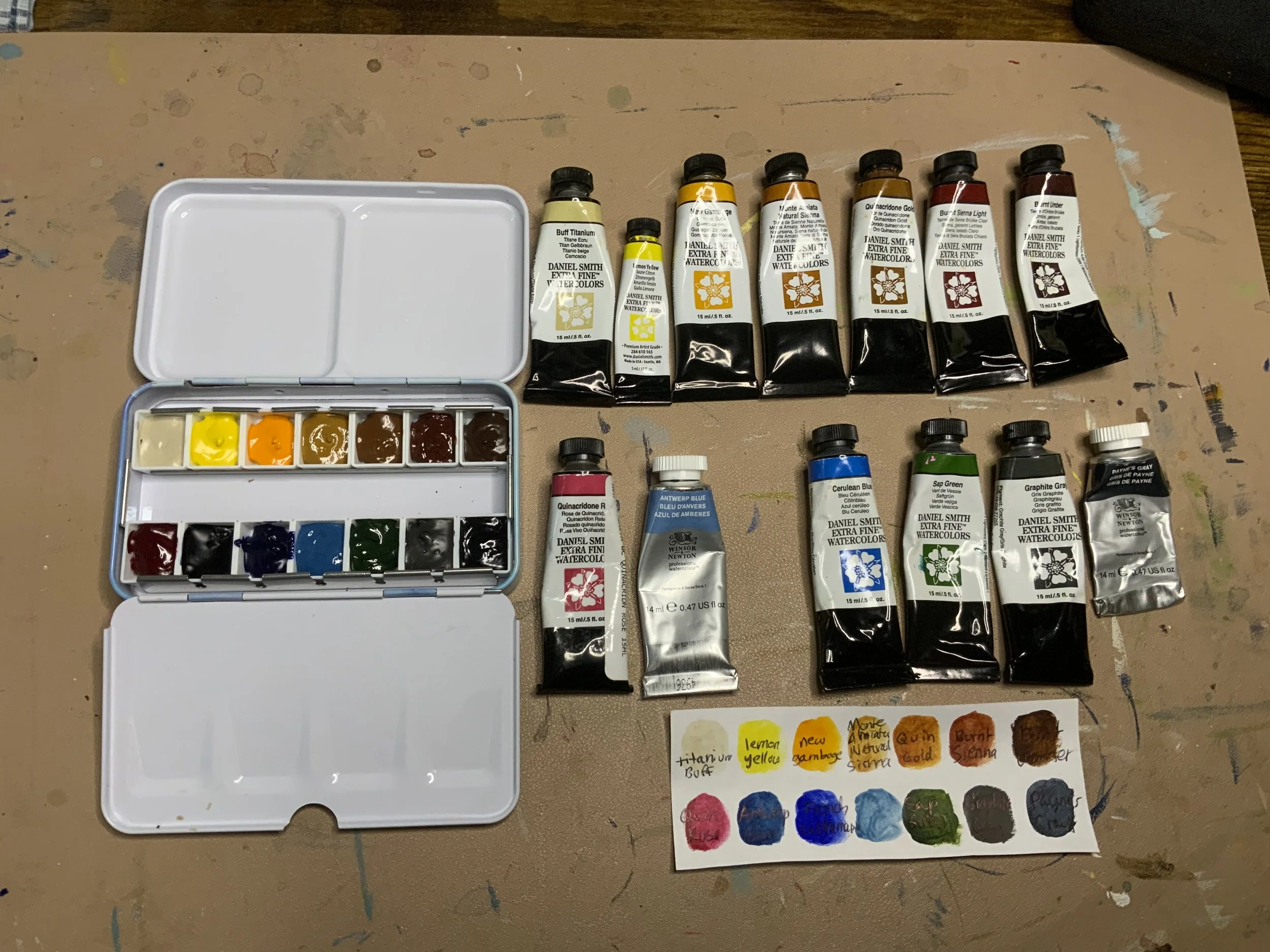
Main studio palette. Colors include Titanium Buff, Lemon Yellow, New Gamboge, Natural Sienna, Quinacradone Gold, Burnt Sienna, Burnt Umber, Quinacradone Rose, Antwerp Blue, French Ultramarine Blue, Cerulean Blue, Sap Green, Graphite Gray, and Payne’s Gray